What's cooking? : Spreadsheet node
A common pattern that arises in production is the "shot-specific branch switcher", typically using a Switch or NameSwitch node to choose the right branch for the current shot. In the fictitious example below, this pattern is employed to select the right render settings per shot, with an ArnoldOptions and StandardOptions node on each branch.
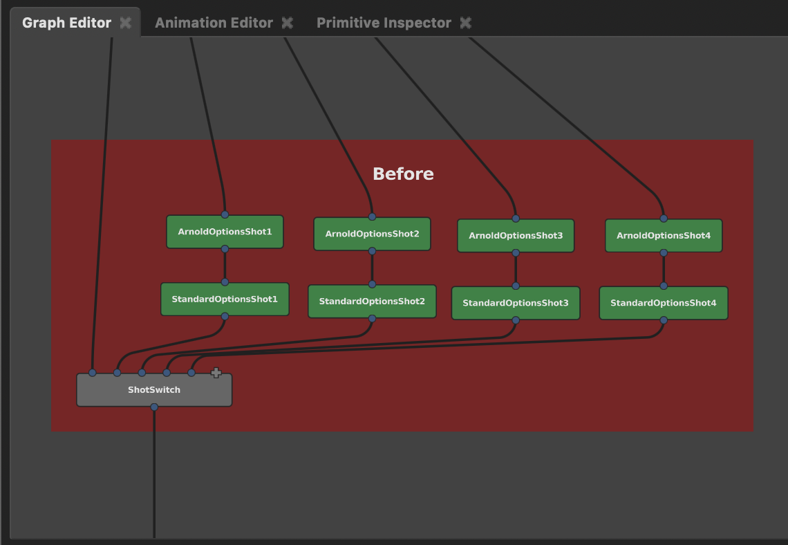
This can be effective, but as the number of shots builds up, you end up with significant duplication of nodes and increasingly wide and unwieldy graphs.
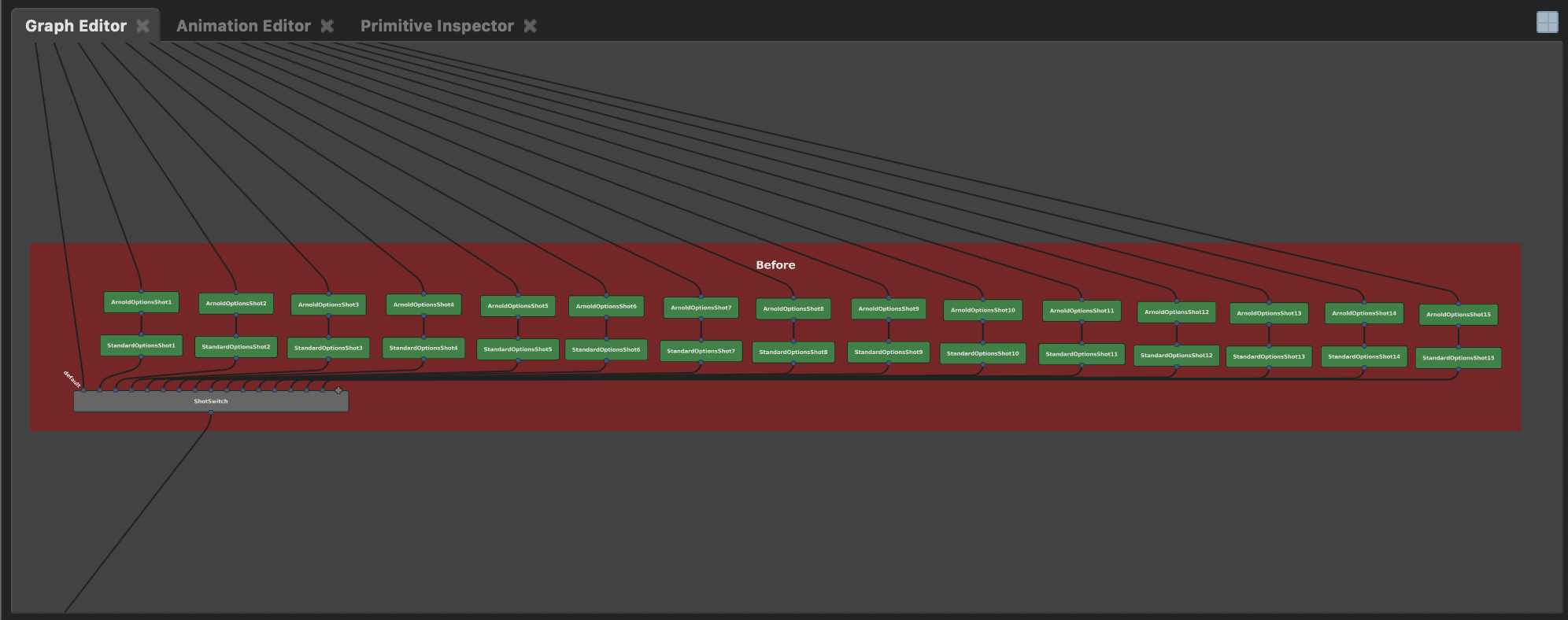
An obvious improvement might be a spreadsheet-style UI, which could present all the settings for all the nodes in a single view. This would beat clicking through the nodes one-by-one and using the Node Editor to edit each node individually. It'd provide a good overview, but the graph itself would still be crazy wide.
This got us thinking, rather than a spreadsheet UI, why not a spreadsheet node? This would transform the example above into the example below, with no branching, and no duplication.
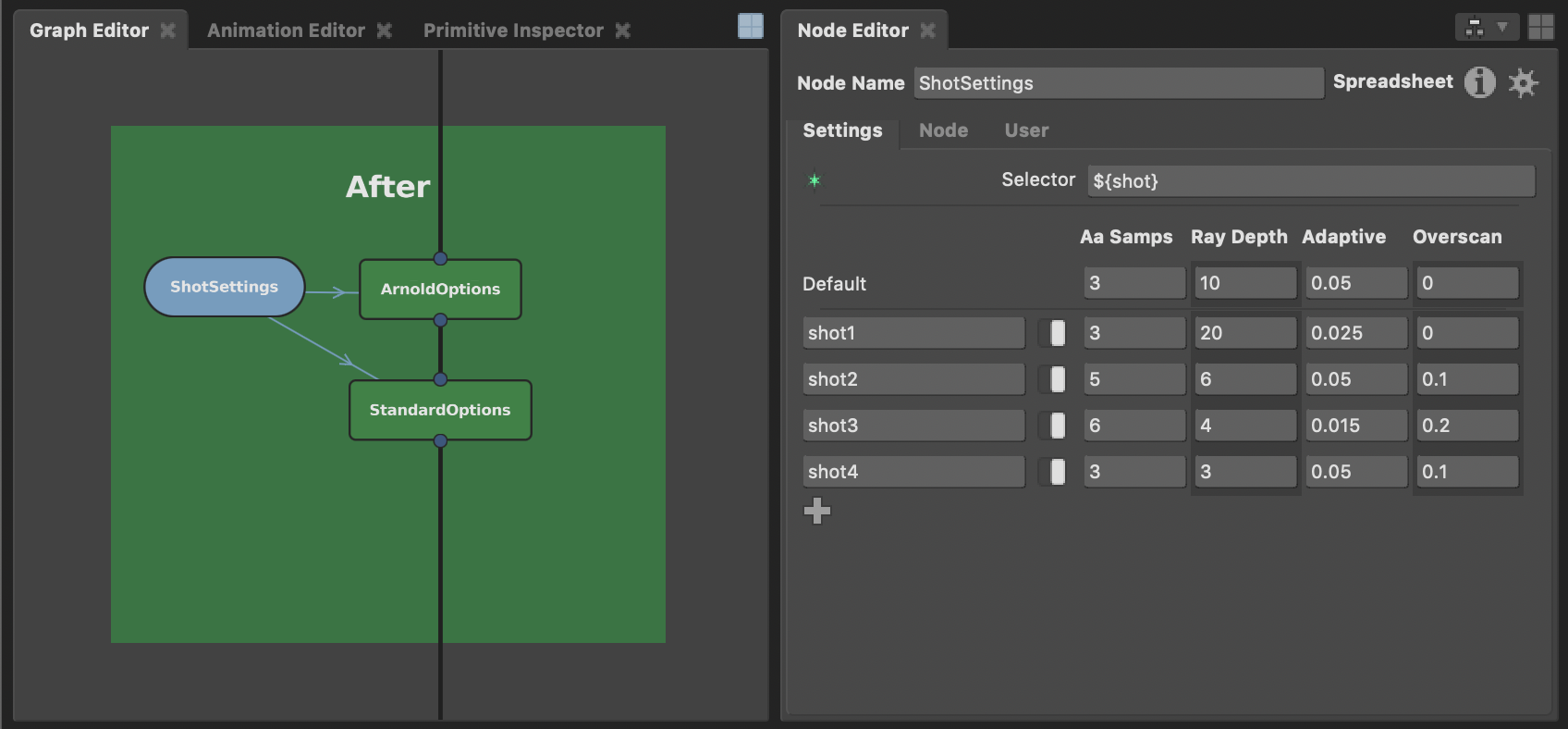
Working this way, each row in the spreadsheet contains the settings for a particular shot. The spreadsheet node takes care of feeding out the right settings based on the current shot context, and those settings always feed into the same two nodes. Adding settings for a new shot is simply a case of adding a new row to the spreadsheet, with no addition of nodes whatsoever.
We're in the final stages of implementing this Spreadsheet node, and anticipate it landing in the Gaffer 0.55 series before long. We're also ensuring it integrates well with the CollectScenes and PathFilter nodes, with interesting ramifications for other common graph patterns. More of that later...
